ILONA LAURA
BRANDING

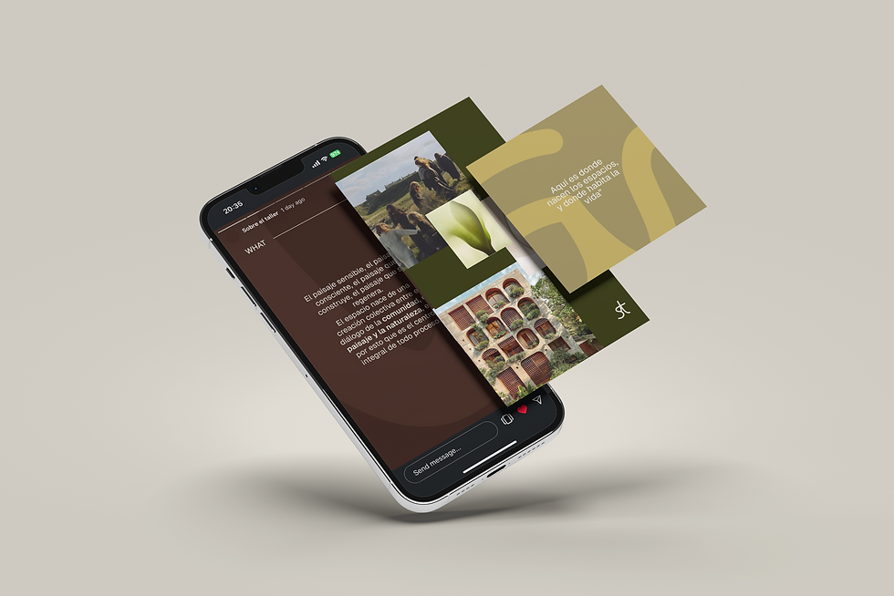
Sobre Trazos is an independent architecture studio based in Medellín, Colombia. The foundation of this studio is its belief in community and nature at the core of the creative process.
Sobre Trazos believes in an open and meaningful architecture to create a connection between people, the landscape, and the identity of the place. Conscious design is the tool to restore meaning to what we inhabit, placing people and the territory at the center of the process.
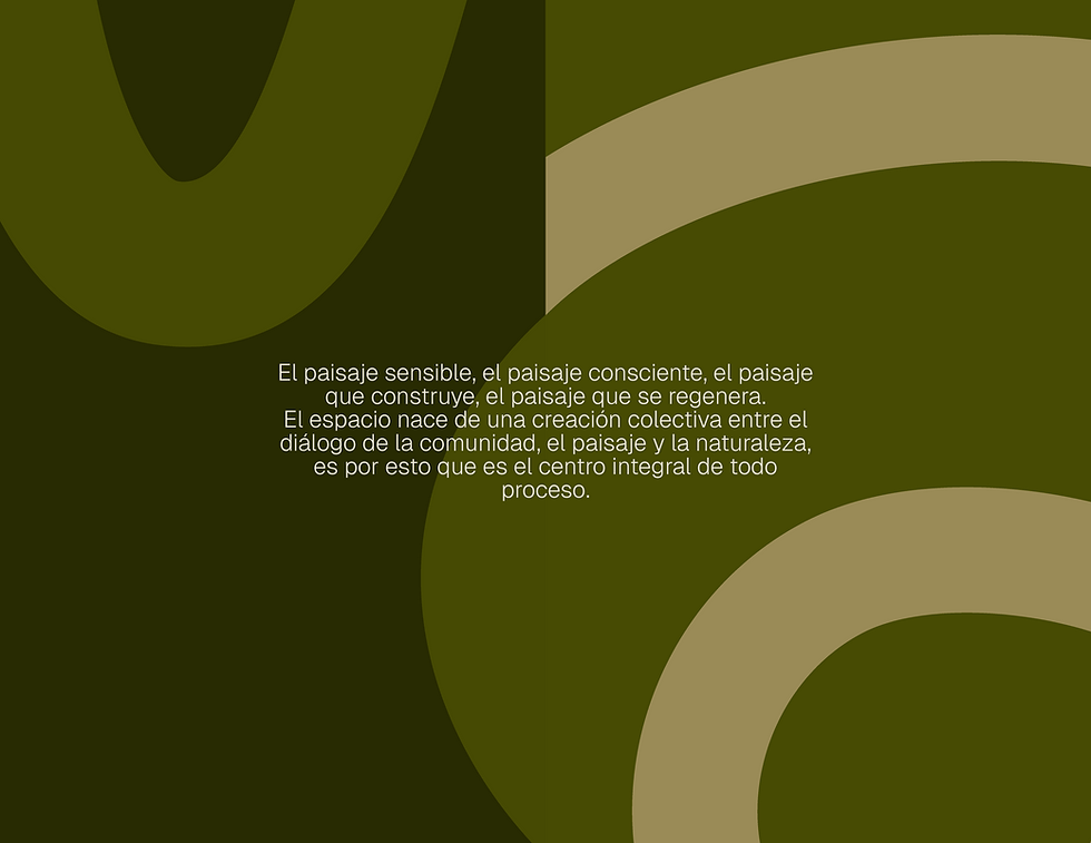
The branding sets a foundation in nature- the colors and its geometry. Creating a logo that reflects the curvature of tree rings and the connection between words to reflect the name: Traces. Simple and sophisticated. Human and modern.
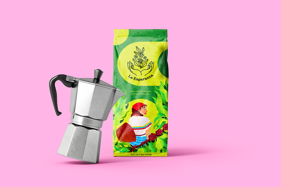

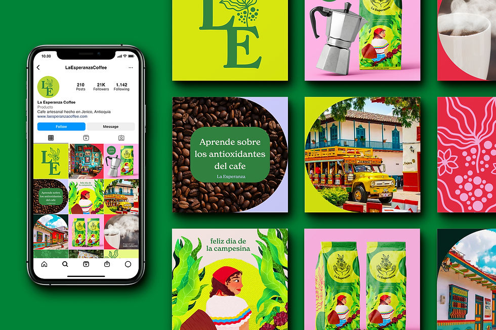
La Esperanza is a Colombian female-founded coffee brand. Locally made around the mountains of the Andean region, harvested with love and hard work.
Challenge: The brand began as a family product, only distributed between its members. As the flavor and production became more of a passion, the coffee began to be sold around the small town. The owner wanted an upgrade that would allow her to expand her customer range and sell the products around the region.
Solution: The combination of illustration and design was the best route for the brand, to visually depict the essence of the coffee. The logo uses the idea of the brand, "hope," and the manual labor of coffee production symbolized through the hands. Lastly, bold and vibrant colors found in Colombian folk art. As a result: a modern, bold, fun brand that respects the visual traditions of the region.
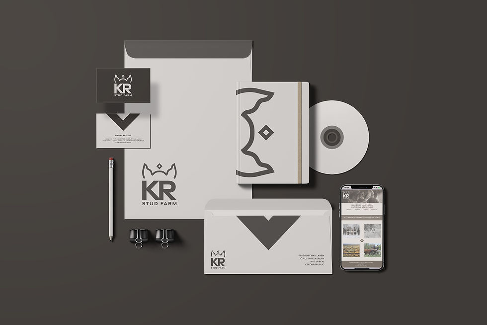
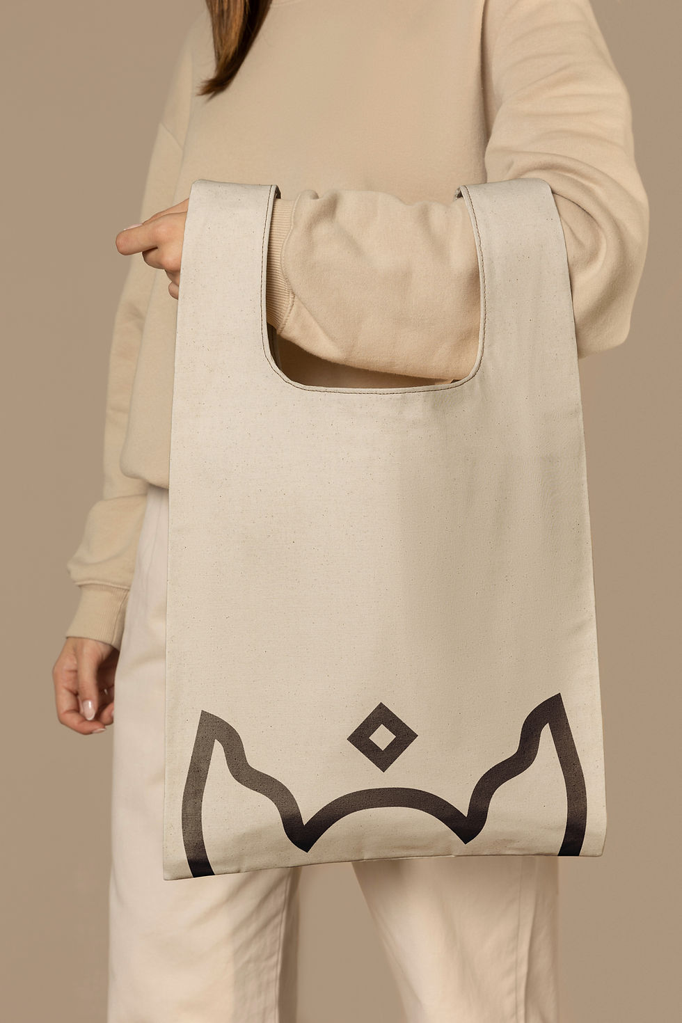
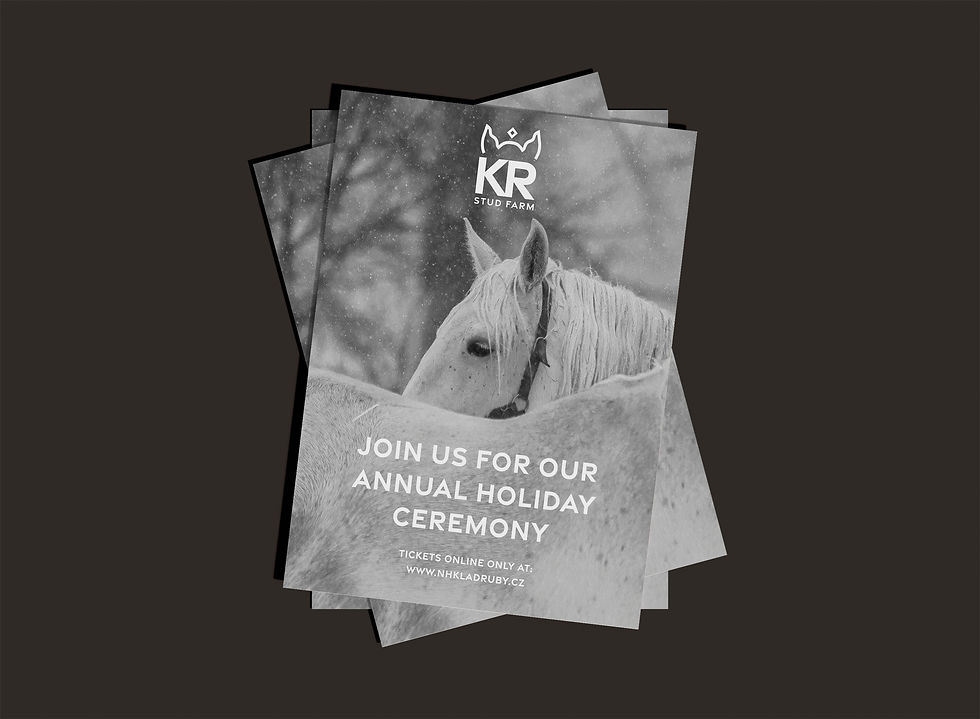
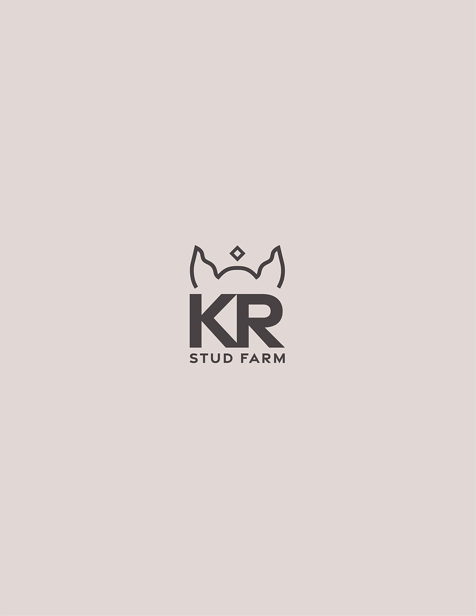
Kladruby Stud Farm is a farm for royal horses that to this day still serve in certain events for monarchs and special occasions and it's part of the UNESCO World Heritage Site. The Landscape for Breeding and Training of Ceremonial Carriage Horses at Kladruby nad Labem is situated in the Polabská nížina (Elbe Lowland), in the Střední Polabí area (Czechia).
Challenge: A need to visually represent the history of these historic horses by having a sleek, classical, and recognizable brand.
Solution: Creating a simple yet distinguishable brand. Playing around the horses' characteristics and physical attributes led me to use their ears as an icon for the logo that also merged into a crown symbol using a diamond shape at the top. The logo has the simplified version of the name, making this the simple, geometrical, and sleek version of them all.
/
Personal Project
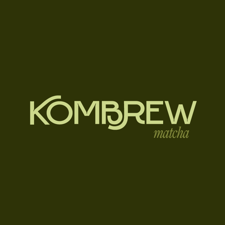
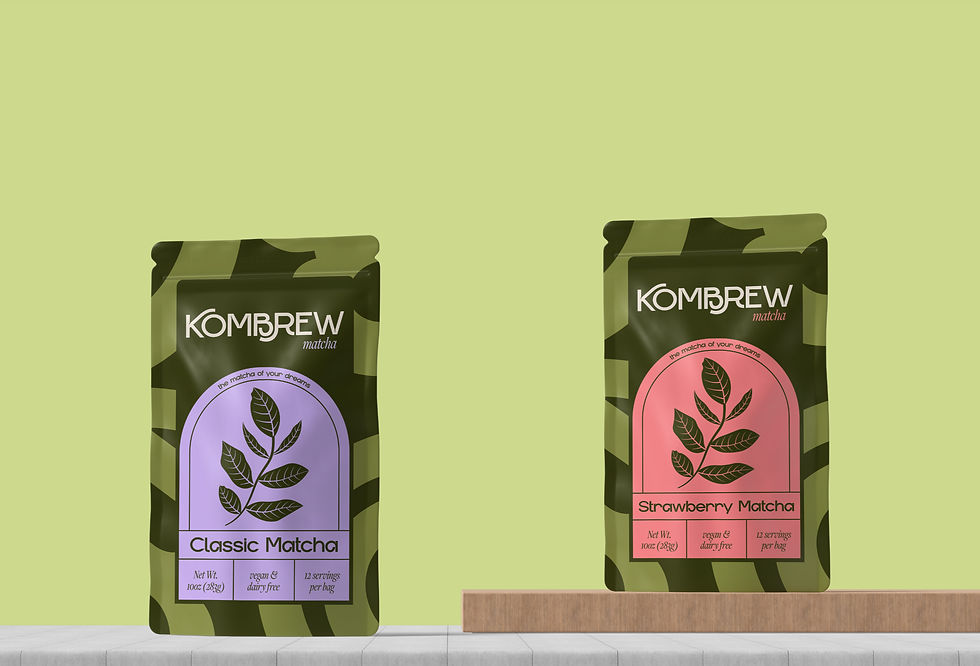
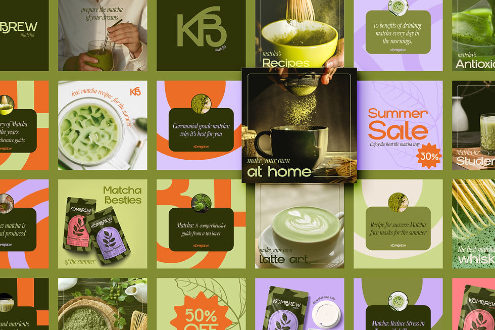

Kombrew is a brand new matcha business helping their clients acquire the most delicious yet natural products- matcha that tastes good but is perfect for your gut health.
Challenge: The brand has a lot of competitors in the industry, and given that matcha has become such a sought-after beverage, it was really important for the client to make the design stand. The branding required a modern, bold, yet natural feeling.
Solution: Having greens as the base and adding accent colors will allow for a playful and flexible brand. Matching modern elements like shapes, bold decorative fonts, with more sleek ones like line work illustrations and serif fonts was the perfect combination.
/
Personal project